For a moment think about the store signs of Burger King, or KFC, or Pizza Hut. Instantly, you would picture your favorite burger, or pizza you usually eat there in your mind, alluring you, may be even have cravings and feel a bit hungry. That’s what these brand logos are designed to do!
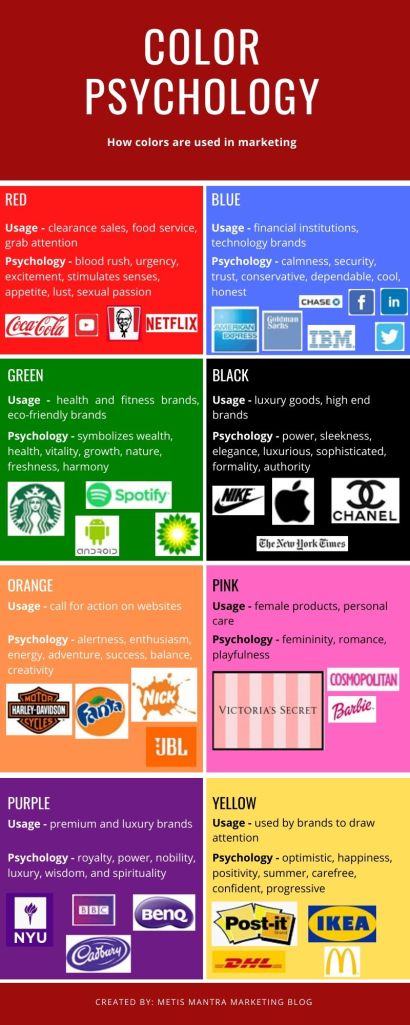
Red is a standard and well-established color used by eatery brands with red in their logos, signboards, billboards, packaging, website and even inside the restaurants. Nearly, all the fast food brands use red in some part of their visual branding and designs. As a matter of fact, red is a highly impactful and significant color for marketing not just for fast food and eating joints, but across several industries. Red is a warm color which draws attentions and calls for action. It creates a blood rush, sense of urgency, stimulates senses such as appetite, lust and sexual passion. Due to these psychological effects, red is, may be, the most used color in marketing hands down across all industries – simply, because it immediately draws attentions and creates a sense of excitement.
But there are other colors too, which have similar effect on your buyer psyche creating different kinds of feelings and emotions. Yellow, for instance, can invoke positive and optimistic feelings, and it is also a color that draws instant attention.
Purple and black both have similar connotations of power, authority. Hence, both these colors are frequently used by luxury and premium brands. Think Apple and Burberry!
Blue is the established branding color theme generally for tech and financial giants since it symbolizes trust, confidence, dependability and security. When you invest your hard-earned money in a bank sitting in their blue themed office, or digitally via a blue themed website, you would have feelings of security and trust in your bank.
Here’s an infographic that shows the psychological effects and common usage across industries for eight of the most used colors in marketing. Of course, brands don’t restrict themselves to these eight colors. They use a mix of these colors, different hues and saturations to use various shades from these color families.
Outside of these eight, there is white which stands for cleanliness, uniformity, goodness and innocence. White is a highly used color in e-commerce websites that gives a sense of clarity and doesn’t make the site, or app look too cluttered.
There’s also grey which gives a neutral and balanced feeling, being the intermediate color between black and white. Grey is also extensively used as part of coloring schemes of websites in combination with other colors.
Finally, brown is a very earthy color and stands for comfort and security. It is often used for natural products, food such as coffee, chocolate, etc.
Although there are niches such as blue for banks and tech, there are numerous outlier brands as well that have totally different color themes. Some colors such as white and grey also have different meanings across different cultures.
What are some brands you thought of that do no follow the niche color psychology for those industries?
